Well, it was time for a new logo to coincide with some minor visual updates to the website. Like the saying, “out with the old, in with the new.”
The old logo, with a circle encompassing a t-shirt, is too vague to reflect the vision and attitude of GrafixFreak. Yes, the designs are purchased mainly for t-shirts; so the old design reflected that aspect but, it was inadequately reflecting the vibe of the website.
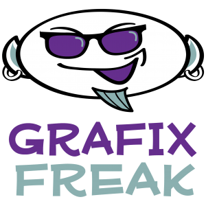
Enter logo version 2.0. It is edgier and has a personality. The new graphic consists of an edgy bald character with a goatee. The look of the new design is a better reflection of the t-shirt designs represented on GrafixFreak. The designs being created are hip and trendy; and some push the boundaries of political satire. The new logo, the “Grafix Freak,” is a much better representation (and mascot) for the site than the original version.
The new site identity maintains the same color scheme. The headings of the website are updated with some edgy-looking fonts. We hope you like the new look. Check out the designs. And always, enjoy your visit.


